
Red Aesthetic
- RED
- BLUE
- YELLOW
- GREEN
Overview
Red is the color of passion. It is on the far right of the color spectrum.
Because red is so intense, it can be overwhelming. Studies have shown that a room painted red can be stressful for the occupants inside.
When paired with blue and yellow (the other primary colors), it can convey strength. When used with green, it will attract attention.
Use red with caution. Use too much and your audience will tune out.

Red & the Primary Colors
Because red is so intense, it can be overwhelming. Studies have shown that a room painted red can be stressful for the occupants inside. When used with blue and yellow, red is often used as a highlight color.
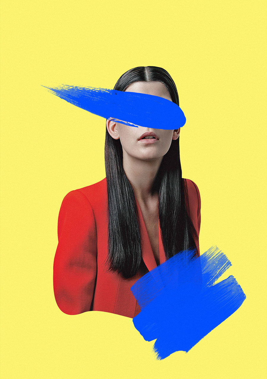
Yellow is the dominant color here, with red and blue acting as highlights.
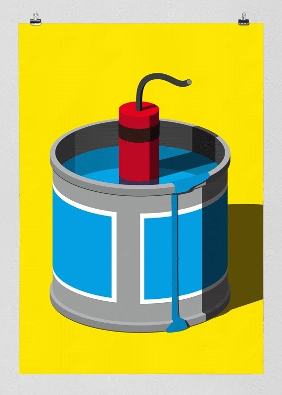
Red is explosive.
Primary colors act as a good anchor and can pull a design together.
Poster Design
Some examples of red being used in poster design.
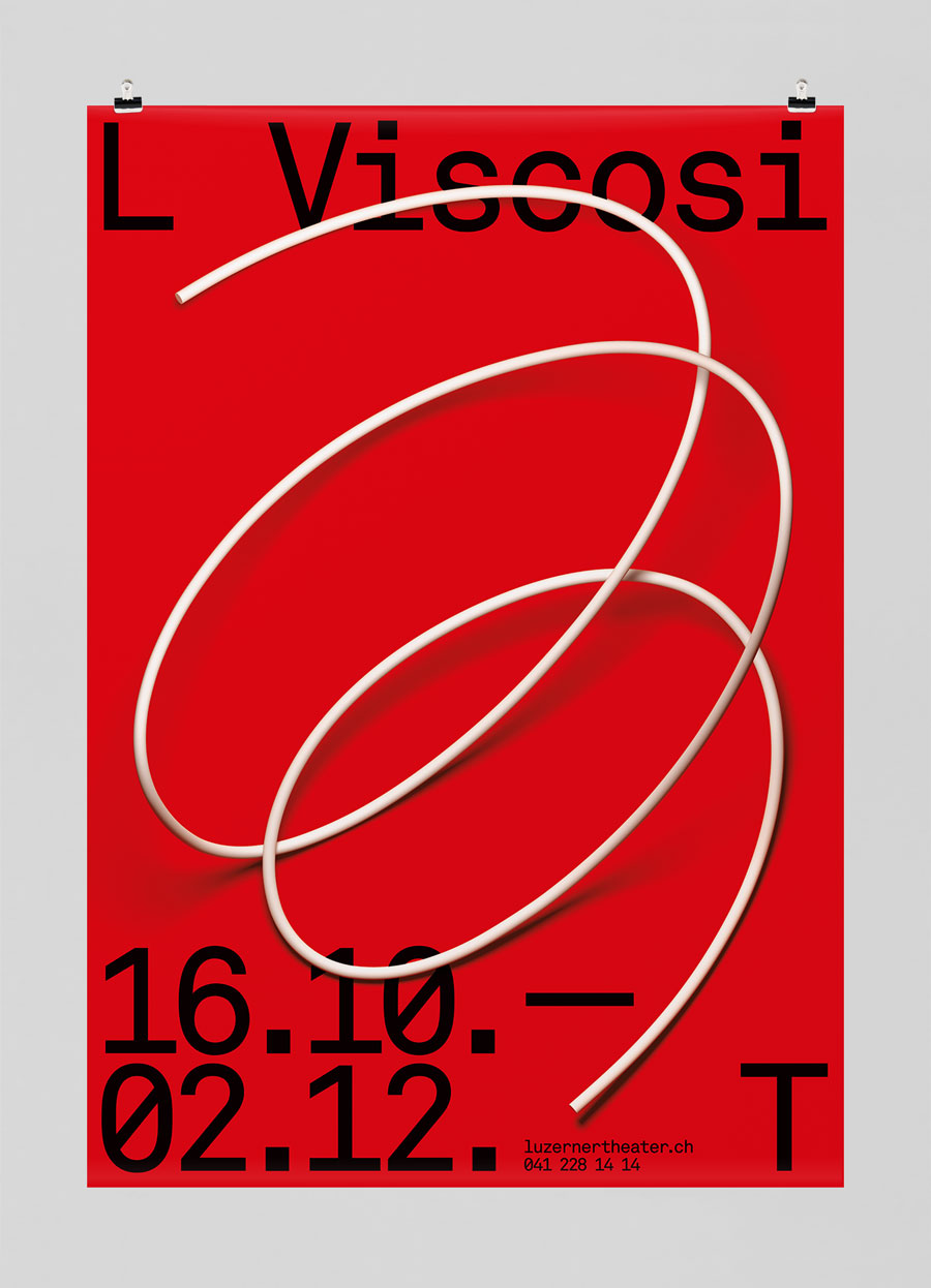
This poster is simple but it grabs your attention because it is red.

Red is the color of death. It is used here to reinforce that feeling of dread in the play Death of a Salesman.
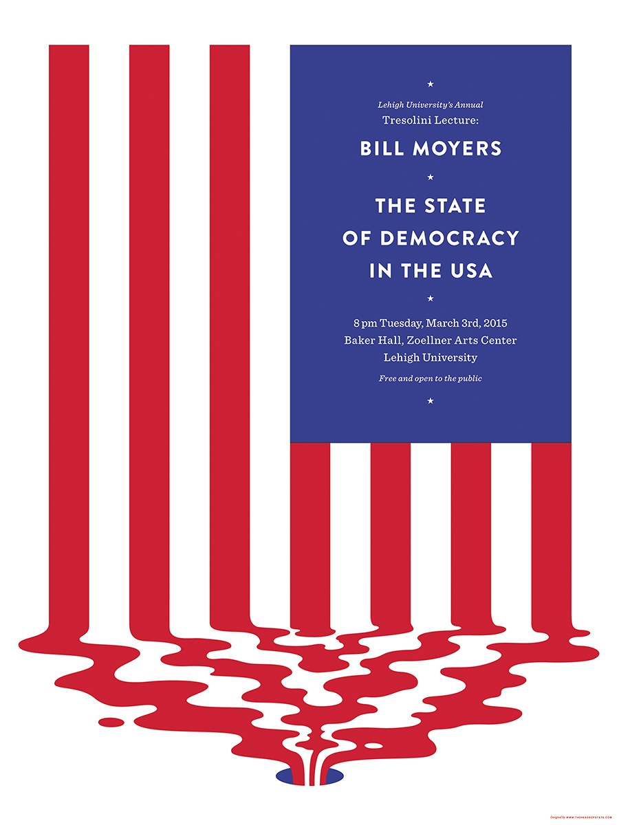
Stripes on the flag turn to blood here.
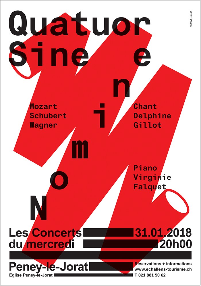
A bold jagged line grabs the users attention.

A human face will always draw people in, but the red square here is equally powerful at getting attention. In this design your eye bounces back and forth from the foreground to background between the two.
Web Design
If red were used as a dominant color on a website it could overwhelm the user. In these examples red is often used as a highlight color instead.
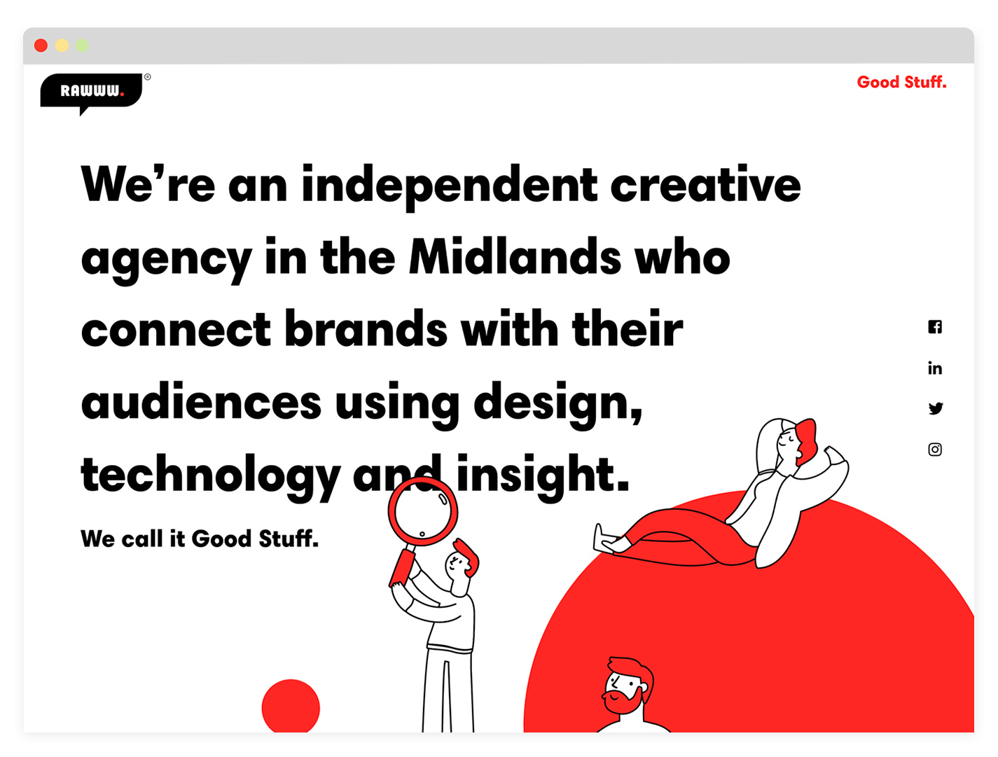
Limited amounts of red makes this site pleasant to use.
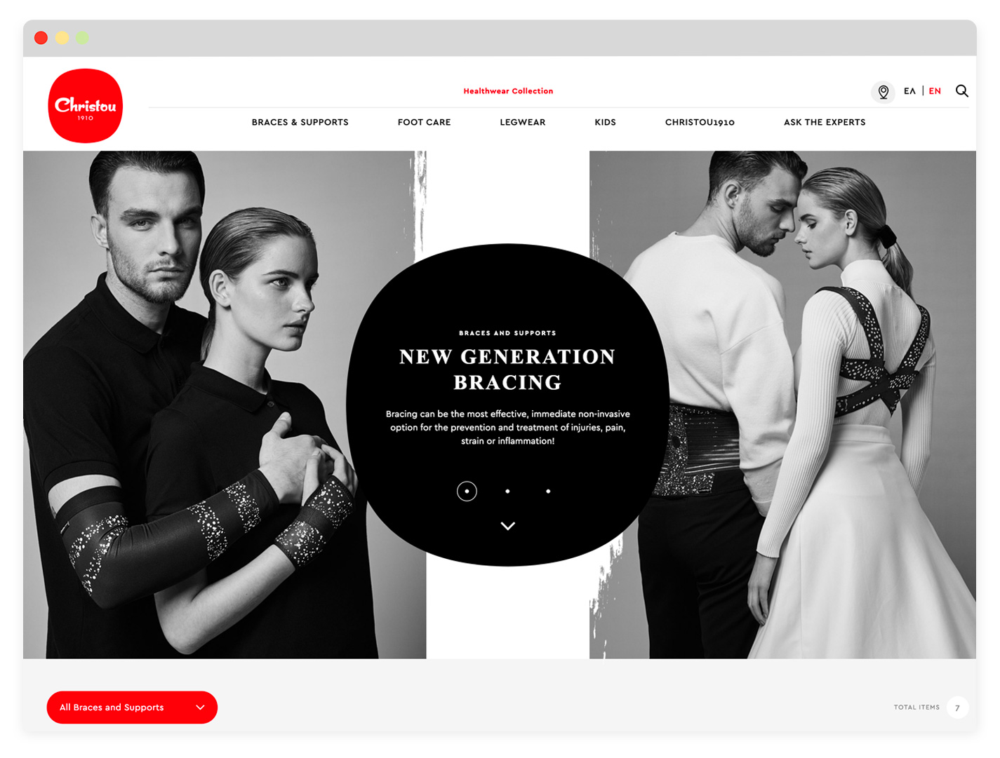
Red is used on the CTA's here.
Advertising
Red is the most active color on the spectrum. It calls attention to itself. Advertisers leverage this to grab attention.
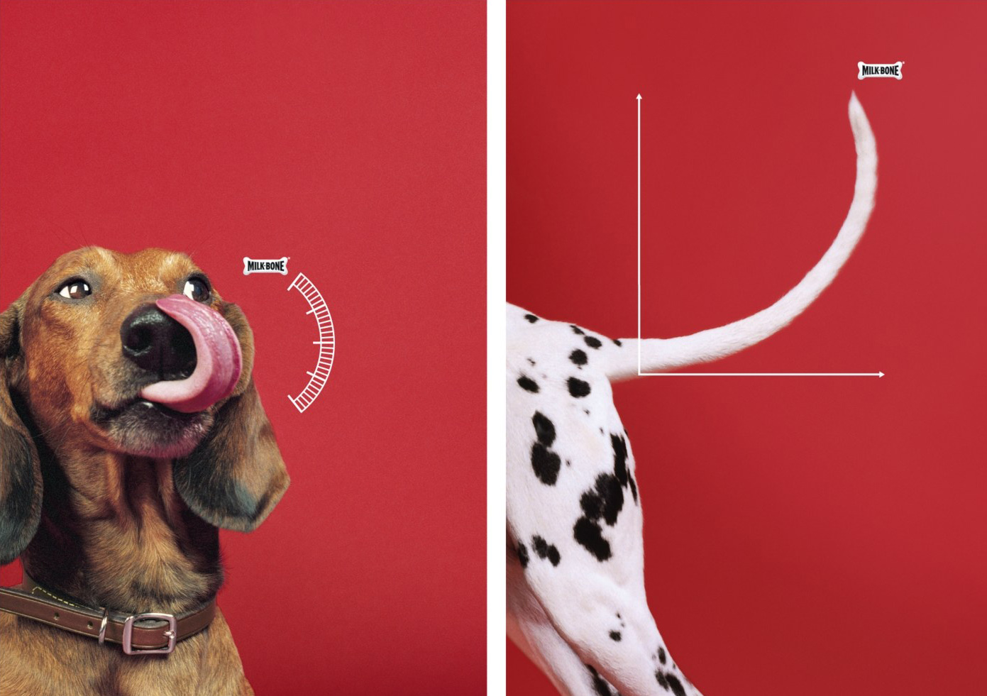
These good boys look great next to red.
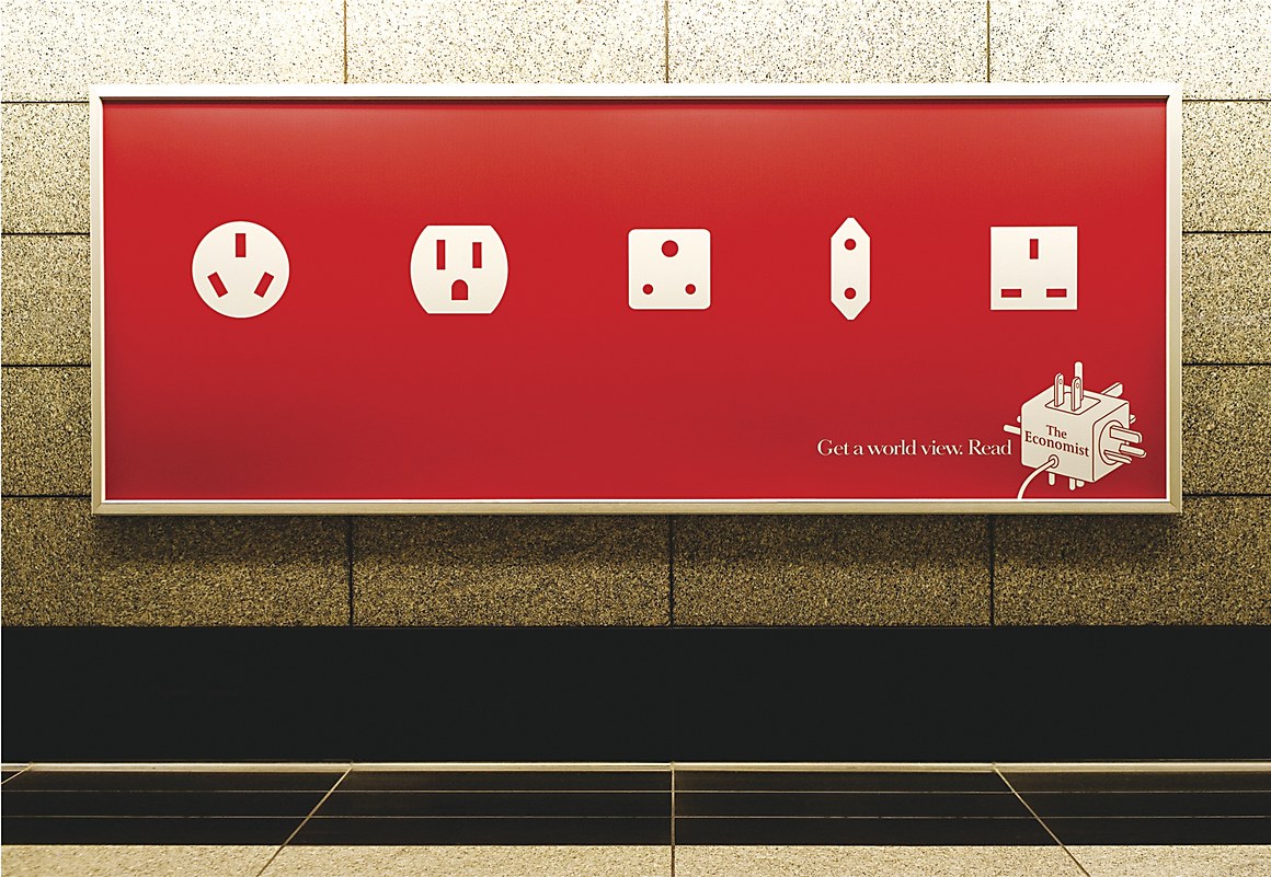
The boldness and simplicty of this ad draws you in. When the viewer sees it, it's a like a little puzzle their brain wants to solve.